- You are here:
-
Home

-
Companies & Campaigns
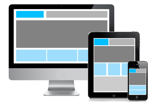
- Each screen is different, thus, use responsive design for your emails
- Category: December 2014 - Email Marketing
 On which device do you read your emails? Desktop, laptop, tablet, smartphone?
Create your emails using responsive design to reach all users and don’t forget to consider your small daily companion when designing a newsletter template. Unfortunately, newsletters that you can read excellently on your desktop are often becoming unreadable on a small screen: small font sizes, narrow line spacing and unfortunate breaks in the layout are annoying to the readers.
A study of Bluehornet showed that 71.2% of respondents delete emails that are not shown properly on their mobile phone or tablet and 16.3% said they would even unsubscribe.
Increase the usability of your templates
No one likes dealing with a confusing email in which it is a challenge to click a link or button. In order to increase the usability of the mailings, email campaigns and landing pages must be planned mobile compliant. For instance, 600 pixels is the default layout of a newsletter.
In order to load quickly on a smartphone, the pixel width of a template must be adjusted to 80% of the original layout size. However, the characteristics of the different types of devices and operating systems should be kept in mind.
Therefore, make sure you plan and structure your templates clearly and that you keep the design of the newsletter as simple as possible. Use e.g. images instead of long texts. In addition, buttons should be increased to enable simple clicking. On a mobile device, you have two preview lines available, the so-called pre-header. Use them as an extension of the subject line to pique the readers’ curiosity. Limit yourself to the basics and shorten the desktop version of your template.
One design for all devices
One approach to optimize emails for different devices is responsive design. The technical basis for responsive templates is HTML5 and the necessary media queries, added in CSS3, that let the presentation of content be tailored to a specific range of output devices without having to change the content itself.
Media Queries detect the screen size of the device, regardless of the brand and the software version, and fall back on the pre-defined rules for each screen. They can be used, for example, to change the layout of the mailings to adjust the size of text, images and buttons and even hide content in some cases or exchange between desktop and mobile devices.
A flexible grid, which consists of fixed breakpoints, ensures the adaptation of the layout, which are set in the CSS code. If you define, for instance, the width to 550 pixels, an appropriate style sheet could load as soon as the viewport width is less than 550 pixels. Photos and videos must be responsive as well. The defined breakpoints then ensure that they are loaded in an alternate size.
However, not all CSS and HTML5 codes work in conjunction with responsive design. Tough breaks in the layout are limited and multi-column layouts and certain provider settings may cause display problems as well. Therefore, it is important to test the template extensively prior to the sending.
Take a look at the brief checklist for mobile optimization:
- Template width: 320 to 550 pixels or 80% of the original width
- Call-to-action: Eye-catching placement that is "clickable" (at least 44 x 44 pixels.)
- Layout: Clear structure, designed as single-column
- Pre-header: Using the two preview lines as an extension of the subject line to pique the reader’s curiosity
- Usability: bigger fonts, adjust line spacing and empty space, make buttons big enough
- Intensive testing: Test the representation of the template on most popular devices prior to sending out.
Source: Silver Media Direkt Marketing GmbH
